My Role and Project Background
I was at Best Buy on contract as a UX designer and product writer and from March 2010 to December 2011. My team was the interactive technology design group at headquarters and our role at the company was to design, test, and manage the interactive product experiences for all of the Best Buy stores. My role was a combination of learning about interactive devices and working with the Visual Merchandising team on advertising and design. My primary assignment was to develop a process for publishing PDF and HTML materials from a single source. The goal was for staff at the stores to complete all of their setup and installation tasks on phones and tablets rather than requiring them to use printed materials.
One of many sketches of store display materials produced when at Best Buy
Methods and Strategy
The first step was to get access to the stylesheets being used on the website and the design patterns that were being used in the Visual Merchandising documentation. I didn’t need to use all of the code from the CSS, but I did need the attributes for the common components like headings, body, and images so that these could be used when mapping the Word documents to the HTML content. The following images show how the Word document styles for headings 1-3, body, and images would look on a phone and tablet.
Solutions and Delivery
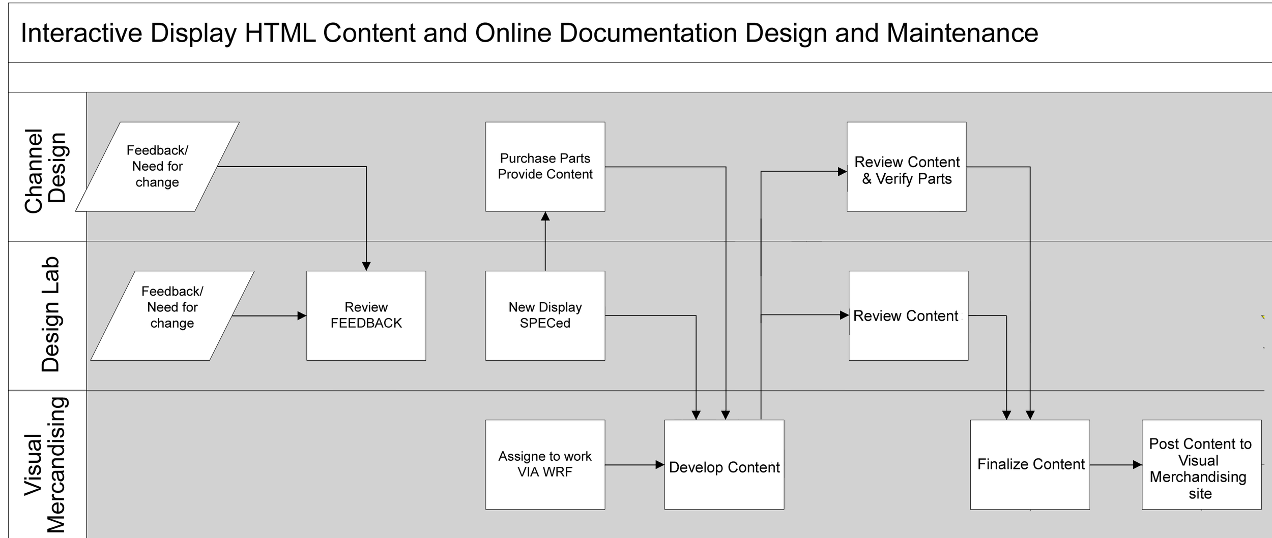
While developing store setup documentation and working with a content management group to gain understanding of how icons, images, and text content was distributed accurately across the 1,200+ stores, I was able to figure out the general process for how content requests (new and maintenance) are handled across the groups. The big takeaway from this work was that Visual Merchandising, Design Lab, and front-end web team were not working together early enough for the content to be ready for posting as HTML and viewed online. This process is shown in the following image. It needed to be changed to get the three groups engaged earlier in the development process.
Project Wrap-up
The remainder of the project from the UX side of things consisted of design work to provide resources to use when working in Photoshop or in Word to produce PDF and HTML content that aligned with brand guidelines, and that had a consistent look regardless of content type, could accommodate responsive layouts, and were easy to use.
Playbook
The playbook is a design resource to help understand Word templates, cascading stylesheets, the relationship between them, and now to map styles from Microsoft Word and other applications to HTML and online display.
Iconography
The team sometimes used icons in their content, but they did not use them consistently or even use the same icons for the same action. To help out with this, I created a set of icons at 16x16-pixels and another at 24x24-pixels that would work for their content.
Icons provided to the team at Best Buy for use in their online and PDF content
Design system
With such a strong brand presence already in place through the company guidelines, I didn’t have much to do when it came to colors or And with the Visual Merchandising taking the lead on almost all of the design work and iconography, there wasn’t much required of me to produce new images. That said, the icons and design patterns were not always easy to access or locate, which left me with a chance to pull together a pattern library and brand handbook. Here are a few of the design components from this handbook. All of the banners, buttons, and callouts were saved as high-pixel count images so that they could be scaled down and retain resolution. I also provided Word, PowerPoint, and Photoshop files with layers in place so that the text could be edited, and the positioning retained.
And at the same time, I was developing store setup documentation and images that were posted online as PDFs for the stores without being mapped to HTML.
Image created for store setup instructions developed when at Best Buy


