My Role and Project Background
I was contacted by the product marketing group to develop a functional prototype to act as an online financial product library. This online library would be a consolidated location for accessing all of the sales sheets, white papers, and marketing content for the products (e.g. annuities, education savings accounts, life insurance, and mutual funds) and strategies (e.g. asset allocation, estate planning, tax management) in the Ameriprise catalog. The end users would be the 10,000+ Ameriprise financial advisors.
Landing page for the Ameriprise 3-Minute Confident Retirement® check that was used as a design and style guide for the Solutions Selection Guide
This site would eventually be available on the existing internal-facing AdvisorCompass website and it was required that it have the same style and layout of the parent site. We based our early designs on the existing 3-Minute Confident Retirement® check that had been recently posted online. We were unable to get access to the design patterns and CSS from the team that owned and maintained AdvisorCompass, which meant that I needed to find a development solution for creating the prototype and to create our own page layouts and potentially style our content without a CSS. We also needed to develop something that people without any UX, CSS, or HTML skills could maintain.
Methods and Strategy
I had plenty of experience putting together functional prototypes using tools like Bluefish, Dreamweaver, FrontPage, Squarespace, and Wix, but none of these were appropriate in this situation because we didn’t have licenses and some of them did not provide adequate security. We ended up using an interactive training application to develop all the pages. We didn’t need any of the built-in quizzing or question libraries that were useful for training, but it provided us an easy tool for site design and online publishing, allowed opportunity for easy online review, and there were resources on the team who knew the tool and could maintain the prototype if needed.
The obvious challenge in this situation was having to use the only the Storyline features to replicate the behavior expected in a typical UX/UI, which meant – for example – having to create and place icons page by page for state changes rather than accomplish this sort of thing with JavaScript and CSS. Ordered and unordered lists also had to be managed one list item at a time: if we wanted to change the spacing between items, then the position of each item had to be manually adjusted rather than adjusted through a change in the attributes of the OL/UL class. Rather than using pages (slides) the prototype made use of layers. Links and bookmarks between elements and pages were managed through triggers.
Solutions Selection Guide development within the Storyline editor; pop-up windows shown include those for editing triggers, state changes, and slide layers
Solutions and Delivery
Early wireframe showing mobile and desktop layout and behavior of the Solutions Selection Guide home page
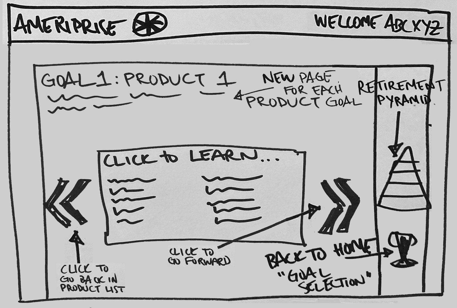
Development was relatively straightforward. We had numerous meetings and hand-sketched wireframes with brand to decide on a layout and icons, then I created a page wrapper to house all the main body content. This wrapper included common elements like header and corporate footer, and it established the layout and scale for the pages.
Along with the prototype design, I also developed pattern libraries including icons and buttons that would be used in the site. This was necessary not only for improving consistency and ease of maintenance but also Brand needed to review and sign off on all of the images and graphics used on the site. Examples of these components are shown below.
Image showing the goal icons and the goal selection icon used in the Solutions Selection Guide.
Image showing the numbered buttons (1-9) used in the Solutions Selection Guide.
Final home page layout for the Solutions Selection Guide
Rather than creating and editing the functional prototype and all of its elements over and over again, I created a several functional copies of the site and presented these in order to get agreement on interface actions. There was what felt like an endless three weeks of tweaks from the groups who had become involved, but we eventually arrived at a winner and were able to begin tracking down and curating meaningful content.
Site prototype available here on Articulate 360 Review.


